Giast PC — Brand Identity

- BRANDING
- Branding

A visual identity system rooted in modularity: the logo is deconstructable, just like the components of a custom PC. Swiss Design inspiration translates into a rigorous grid, enriched by motion elements that bring the brand to life. Modular communication for a brand made of modules.
- Brand Strategist
- Tommaso Anzidei
- Brand Designer
- Lorenzo Peparini
The branding project is built on one key concept: modularity. The logo was designed to be flexible and to break apart, just like an assembled computer where every part can be replaced, modified or upgraded. A trait that isn't just a visual reference but a true design principle.
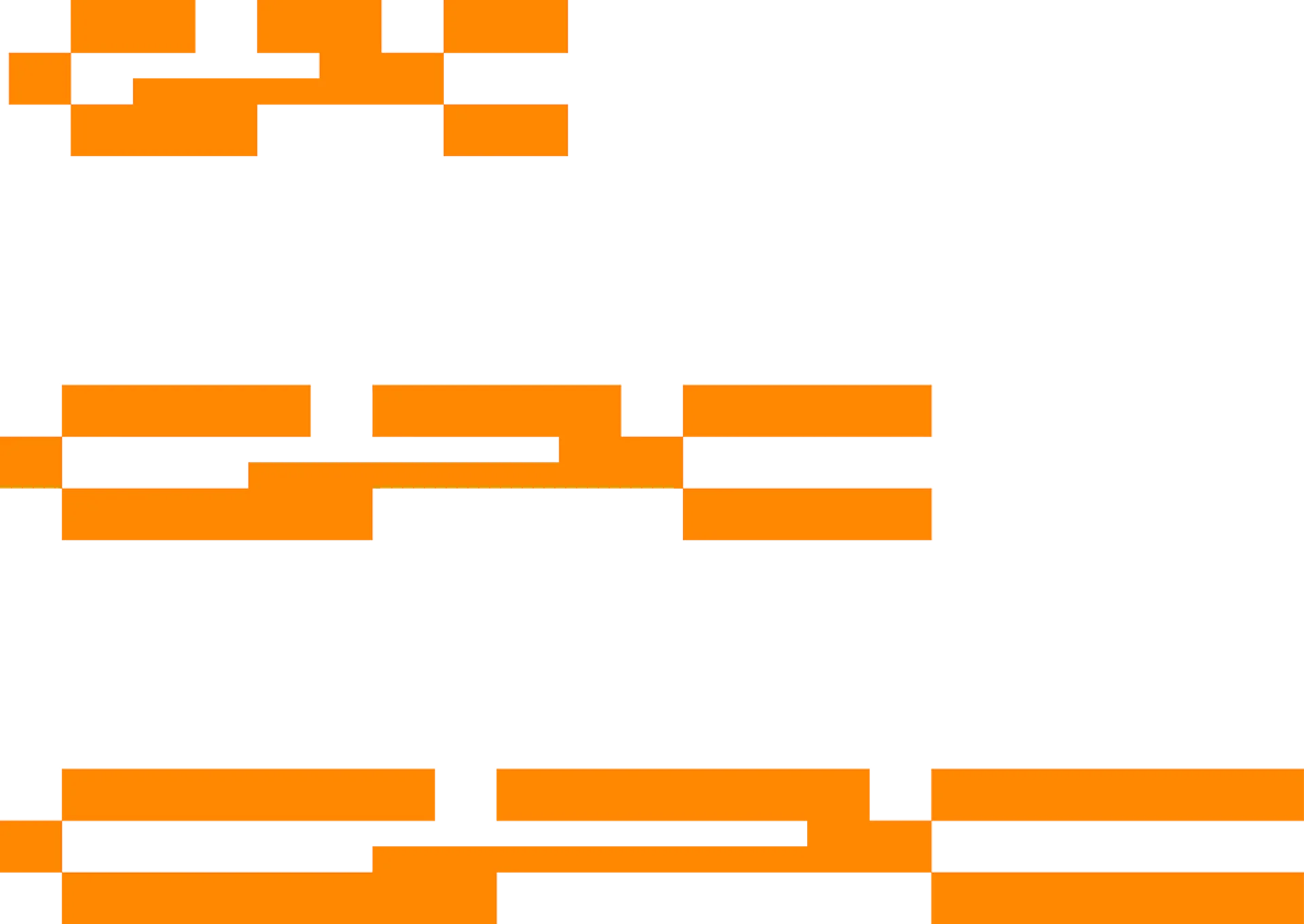
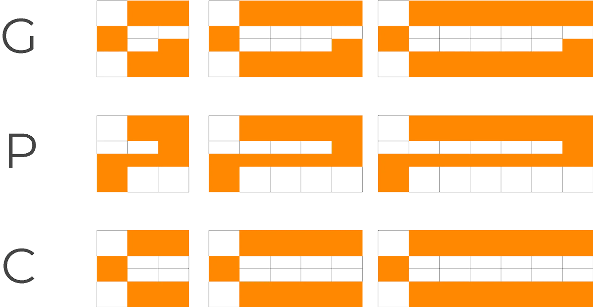

The main inspiration comes from Swiss Design, a movement that turned modular grids into its strength. This approach ensures order while making the entire visual system solid, versatile and coherent.
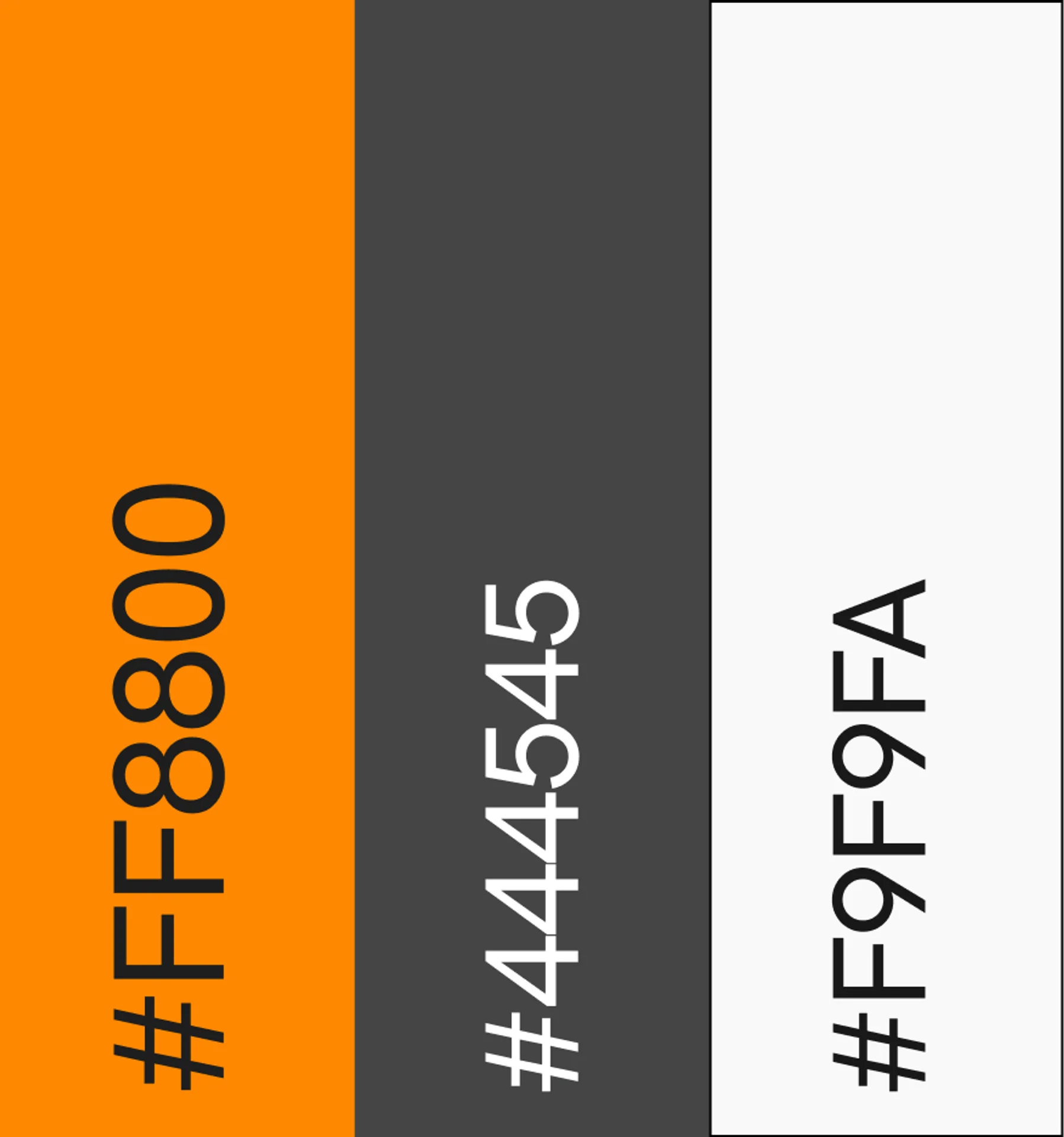
Orange was chosen because it's a colour with a strong presence in the tech world, yet today it takes on a more exclusive, aspirational meaning. It grabs attention, sparks a desire for uniqueness in consumers and strengthens the brand's positioning through its association with a luxury imagery. More than an aesthetic choice: an identity signal that blends innovation, uniqueness and premium value.

